 b1c8f156dc * [Settings] Add hover zoom/panel triggers, delays, and double-confirm * [Game] Smooth board hover-zoom with fade helpers * [Game] Add hover card panel with tabbed actions * [Game] Wire hover zoom/panel triggers through the scene * [Game] Repaint cached zones when the hover zoom moves `TableZone` cuts the hovered card out of its own paint so zone washes, indicators, dimming and the land divider never draw over the zoom. It is a `DeviceCoordinateCache` item, so the card changing geometry never dirtied it and the stale hole stayed transparent, uncovering the black viewport as soon as the zoom crossed a zone edge. - Emit `hoverFootprintChanged(old, new)` from `setCardScale()` and once from `setHovered(false)`. - Repaint every overlapping `TableZone` on that signal. - Clip with the card's painted outline instead of its bounding rectangle, and treat a zoom covering the whole zone as "paint nothing". * [Interface] Keep the hover panel P/T controls out of the way The P/T set/inc/dec rows were always visible and sat under the cursor, so clicking a card to select it could mutate its P/T instead. - Collapse the controls to a pill on the printed P/T box, anchored on the drawn artwork so letterboxed and sideways cards stay aligned. - Open the rows only from the pill and grow them upward, and re-measure the pill on every value so three-digit P/T does not clip. - Close the panel when another card is hovered, and repaint the area it covered so no patch is left behind. * [Interface] Address hover panel review findings * [Game] Fix include order flagged by the format gate The card hover widget header was included before theme_manager.h, which clang-format rejects; the branch's format CI job failed on it. * [Interface] Load the hover panel icons through the themed icon engine The panel still named pre-#7595 assets (arrow_*_green, arrow_right_blue, cogwheel) and built QIcon snapshots from themePixmap(), so the deleted names rendered blank and every other glyph froze one palette. Load every glyph through loadThemedIcon() with the emphasis axis the adoption plan calls for: the category tabs take the primary level as panel wayfinding, the action grid the quiet level because its glyphs label the button text. Semantic tints keep their family and follow the same quiet level; Clone keeps its sticker treatment. * [Icons] Add an Informational semantic color family Face-down play and the exile zone are states that are neither a gain nor a loss, and the pre-#7595 art painted them blue (arrow_right_blue). #7595 dropped that hue, and the icon engine has had only Positive and Negative since, so both states fall back to neutral ink. Add the family with the same three-level ladder the other semantic roles use: authored roles per theme, scheme defaults otherwise, an emphasis mapping, the palette-editor rows and the generator seed. The defaults clear the 4.5:1 label floor on both schemes and the ladder's saturation ordering; the existing emphasis, hue and preview tests now cover the new family. Preview sheets that name roles resolve an unauthored one through the same default the client paints. * [Interface] Split the hover panel icons by emphasis and semantics Category tabs only navigate between pages, so they take the quiet level; the action grid is the surface the player works in and takes the primary level. Both stay line glyphs: a filled treatment reads as a second state on every cell. Hue marks an outcome where the glyph cannot. Play, clone and to hand are Positive; reduce life and graveyard Negative; play face down and exile Informational. Direction-only moves (top and bottom of library) stay neutral because the arrow already carries the meaning. * [Icons] Add Hidden and Marked semantic color families Two game concepts had no hue of their own. Hidden information (a face-down play, peeking at a card face) now has violet, and the marks a player leaves on a card (annotation, draw arrow) now share amber instead of splitting blue and red for the same job. Both families follow the existing three-level ladder: authored roles per theme, scheme defaults otherwise, an emphasis mapping, palette-editor rows and generator seeding. The defaults clear the 4.5:1 floor on the representative platform surfaces and keep the saturation ordering the emphasis tests assert; the hue tests pin violet's blue-red-green dominance and amber's red-green-blue one, and every preview sheet now renders the two families. The hover panel grid preview is added alongside: it renders the real pages (section headers, two-column cells, glyph over label) so the whole map can be judged at once instead of glyph by glyph. * [Icons] Add a Movement semantic color family A card changing position inside the library is neither a gain, a loss nor information, so it had no hue. Movement names it with teal and covers the three library placements (top, bottom, X from top). It follows the existing ladder: authored roles per theme, scheme defaults otherwise, an emphasis mapping, palette-editor rows and generator seeding. The defaults clear the 4.5:1 floor on the representative platform surfaces, keep strong > base > soft saturation, and keep green > blue > red so teal cannot be mistaken for the green gain family. * [Interface] Give every hover panel action a semantic color The quick actions are the panel's whole point, so a neutral glyph made the most-used buttons the hardest to scan. Every action now names a game fact with its hue: gain, loss, information, hidden information, a mark on the card or a move. The line glyph stays identical, so the colour is the only difference between neighbours. The grid is also ordered by family so a row reads as one idea: the two state toggles, the two gains, the two marks, the two hidden-information actions and the two losses each share a row. Conditional actions (Peek, Unattach) sit at the end of their pair, so a missing one leaves a hole at the section edge instead of splitting a row. In a zone, Play and Play Face Down stay adjacent on purpose: the same action, one of them hiding information. The move tab leads with the three library placements (Movement), then the destinations. actionGridIcon is removed; semanticActionIcon is now the only grid ink. The preview renders the real pages so the whole map can be judged at once. * [Icons] Use quiet emphasis for glyphs that label rather than act The search and info glyphs inside the search fields, and the combo-box chevron, label or afford an action rather than performing one. At the default secondary weight they compete with the actual controls next to them. Paint them at quiet emphasis so they stay legible without claiming attention. Sites: deck editor, visual database display, visual deck storage, set manager, settings search, in-game zone view, and the dropdown chevron. * [Icons] Restore sticker treatment to the add, remove and delete actions The pre-#7595 add and delete glyphs were filled shapes with an outline. After the line migration they read as ordinary toolbar glyphs, losing the weight their verbs had. Give the add and delete family the sticker treatment again. - Deck editor Add card: primary positive sticker. It is the one action the database panel exists for. - Visual database Clear filters: negative sticker, matching the delete family. - Filter dock Clear all: negative sticker, matching Clear one. * [Icons] Give sharing and pinning their semantic families Sharing is an informational act: the app already tints reveal and make-public with the informational family, so the deck storage share action, the replay share-code action and the visual deck storage share button follow it. The printing-selector pin badge marks a card as pinned. Paint it with the marked family, the same one used for a mark left on a card, instead of leaving it neutral. * [Game] Dismiss the hover panel before opening a modal dialog The hover panel is a Qt::ToolTip window, i.e. a popup: it is always on top and holds the input grab. Actions on the panel that open a modal dialog (Set power/toughness, Set annotation, Set counter value, token creation) therefore opened the dialog behind the panel, where it could not be seen or activated. Hide the panel synchronously and defer the action to the next event-loop turn, so the popup grab is released before the dialog's event loop starts. The panel asks the scene to dismiss it through a new dismissRequested signal, keeping hover timers and the covered-card fade on the scene's side. Reported from the P/T overlay SET button; the same path covers the counter tab and the token tab. * [Icons] Refine VDE and VDD emphasis and semantics The visual database filter section and the syntax help are information aids, so paint them with the informational family at the default emphasis: the filter section glyph and the search field's help glyph. The help glyph leaves quiet emphasis because it is a clickable action, not a field label. The visual deck editor's display-type toggle is the one control that changes the whole view, so it takes primary emphasis. The search glyphs stay quiet; only the help action changes. * [Icons] Raise the visual database filter controls to primary The six quick-filter buttons are the controls the filter section exists for, so paint them at primary emphasis instead of the default weight. The sort glyph carries the same informational family as the filter glyph, in both the visual database toolbar label and the visual deck editor's sort-criteria button. * [Icons] Keep the display options sort glyph neutral The sort button beside the display-mode toggle is not part of the informational family. Only the visual database toolbar's sort glyph carries informational; the display options button returns to the default neutral weight. --------- Co-authored-by: Lukas Brübach <Bruebach.Lukas@bdosecurity.de> |
||
|---|---|---|
| .ci | ||
| .github | ||
| .tx | ||
| cmake | ||
| cockatrice | ||
| docs | ||
| external | ||
| libcockatrice_card | ||
| libcockatrice_deck_list | ||
| libcockatrice_filters | ||
| libcockatrice_game | ||
| libcockatrice_interfaces | ||
| libcockatrice_models | ||
| libcockatrice_network | ||
| libcockatrice_protocol | ||
| libcockatrice_rng | ||
| libcockatrice_settings | ||
| libcockatrice_utility | ||
| oracle | ||
| servatrice | ||
| Testing | ||
| tests | ||
| tools | ||
| vcpkg@9eec002df1 | ||
| .clang-format | ||
| .cmake-format.json | ||
| .dockerignore | ||
| .gitignore | ||
| .gitmodules | ||
| CMakeLists.txt | ||
| docker-compose.yml | ||
| docker-compose.yml.windows | ||
| Dockerfile | ||
| Doxyfile | ||
| format.sh | ||
| gcovr.cfg | ||
| iwyu.sh | ||
| LICENSE | ||
| publish_beta.sh | ||
| qt6.imp | ||
| README.md | ||
| shell.nix | ||
| vcpkg.json | ||

Cockatrice | Download | Related | Community | Contribute | Build | Run
To get started with Cockatrice ⇢ view our webpage
To get support, or suggest changes to the app ⇢ file an issue (How?)

To learn about the app and its code ⇢ read our code documentation
To help with development ⇢ learn how to contribute
Cockatrice
Cockatrice is an open-source, multiplatform application for playing tabletop card games over a network. The program's server design prevents users from manipulating the game for unfair advantage. The client also provides a single-player mode, which allows users to brew while offline.
This project uses C++ and the Qt libraries.
Download 
Downloads are available for stable releases and the current beta version in development.
There is no strict release schedule for either of them.
Latest stable release:


Latest beta version:


While incorporating the latest fixes and features, beta builds may not be stable or contain new bugs! Please report any findings and open new issues when testing them!
Related Repositories
- Magic-Token: File with MtG token data for use in Cockatrice
- Magic-Spoiler: Code to generate MtG spoiler data from MTGJSON for use in Cockatrice
- cockatrice.github.io: Code of the official Cockatrice webpage
- io.github.Cockatrice.cockatrice: Configuration of our Linux
flatpakpackage hosted at Flathub - Webatrice: Web client for Cockatrice servers (TypeScript / React)
Community Resources 
Join our Discord community to connect with other project contributors (#dev channel) or fellow users of the app. Come here to talk about the application, features, or just to hang out.
Important
For support regarding specific servers, please contact that server's admin/mods and use their dedicated communication channels rather than contacting the team building the software.
Contribute
Code | Documentation | Translation
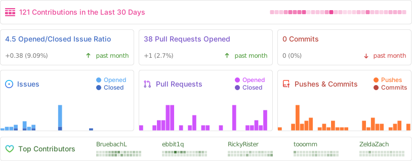
Repository Activity
Code
To commit code to the project, please review our Contribution Guidelines first.
We maintain two tags for contributors to easier find issues to potentially work on:
Issues tagged in this way provide a simple way to get started. They don't require much experience to be worked on.
This tag is used for issues that we are looking for somebody to pick up. Often this is for feature suggestions we support, but don't have the time to work on ourselves.


For both tags, we're willing to provide help to contributors in showing them where and how they can make changes, as well as code reviews for submitted changes.
We'll happily advice on how best to implement a feature, or we can show you where the codebase is doing something similar before you get too far along - put a note on an issue you want to discuss more on!
You can also have a look at our Todo List in our Code Documentation or search the repo for \todo comments.
Documentation 
There are various places where useful information for different needs are maintained:
- Official Code Documentation
- Official Wiki
Community supported - Official Webpage
- Official README
This file - Official CONTRIBUTING
Cockatrice tries to use the Google Developer Documentation Style Guide to ensure consistent documentation.
We encourage everybody to improve the documentation by suggesting edits based on this guide.
Translation 
Cockatrice uses Transifex to manage translations. You can help us bring Cockatrice and Oracle to your language and just adjust single wordings right from within your browser by visiting our Transifex project page. The Webatrice web client manages its own translations in its repo.
Check out our Translator FAQ for more information about getting involved, and join a group of hundreds of others!
Build 

Dependencies: (for minimum versions search our CMake file)
Oracle can optionally use some packages to load compressed card files:
Basic compilation steps:
mkdir build
cd build
cmake ..
make
You can then
- Create a Cockatrice installation inside the
releasefolder:make install - Or make an installation package specific to your system:
make package
Note
Detailed compiling instructions can be found in the Cockatrice wiki at Compiling Cockatrice
The following flags (with their non-default values) can be passed to cmake:
| Flag | Description |
|---|---|
-DWITH_SERVER=1 |
Build Servatrice server |
-DWITH_CLIENT=0 |
Don't build Cockatrice client |
-DWITH_ORACLE=0 |
Don't build Oracle card database tool |
-DCMAKE_BUILD_TYPE=Debug |
Compile in debug mode Enables extra logging output, debug symbols, and much more verbose compiler warnings |
-DWARNING_AS_ERROR=0 |
Don't treat compilation warnings as errors in debug mode |
-DUPDATE_TRANSLATIONS=1 |
Configure make to update the translation .ts files for new strings in the source codeNote: make clean will remove the .ts files |
-DTEST=1 |
Enable regression tests Note: make test to run tests, googletest will be downloaded if not available |
Tip
Build code documentation (Doxygen) according to our configuration into
/docs-output:doxygen Doxyfile
Run
Cockatrice is the game client
Oracle fetches card data
Servatrice is the server
Docker
You can build an image & deploy a Servatrice (Cockatrice server) container using Docker and our Dockerfile yourself.
For more details, look into our wiki section on Setting up Servatrice.
You'll also find more hints on our pre-build image there, or the docker-compose file which will configure and run both a MySQL server and Servatrice.
License 
Cockatrice is free software, licensed under the GPLv2.